I have learned that when you work with a document you only see one page at a time, also with how to work with the panel of choice and to move it around. I now understand where the control panel is located and that the tools located there are present because i will be using those most frequently. I also learned about the keyboard shortcuts to better access what I want to edit. Then when working with the different menus I could also edit them to contain what I 'll need, this could be useful to me as a new user and allows me to better arrange what I'll need to use more efficiently. I also learned how to load images with indesign, and where I want to place each imag and then resize, using the scale field.
I think that the working with objects option will definitely be helpful when working with the different images, and arranging them in the layout just so. In a newsletter filled objects could work well to draw attentiont to images, and texts. Importing images will be beneficial in the portfolio assignment, and the text tool will be helpful with giving explanations of work, and within the layout of a newsletter. I also feel that working with the line tool I can create my own customized lines, to make the newsletter interesting to draw attention to certain images.
Creating the multiple pages using the tips from the video will come in assistance with the layout of newsletter, but for organizing the order of a portfolio as well.
Friday, March 26, 2010
Friday, March 19, 2010
Refrence for self portrait
I found this set of directions helpful for editing color within a black and white image. Reading this directions that are step by step seem to be a great reference to refer back to if I decide to work with a black and white image, and then add color to it. I'm thinking I will just be adding parts of color to the self portrait I chose, so I found this site helpful with breaking down the steps. I wish it were a video though, so I may look into another tutorial video for further assistance if needed. However, I thought that this one was basic enough to get started with my ideas.
http://emptyeasel.com/2008/04/29/how-to-add-color-to-black-and-white-photos-in-photoshop/
http://emptyeasel.com/2008/04/29/how-to-add-color-to-black-and-white-photos-in-photoshop/
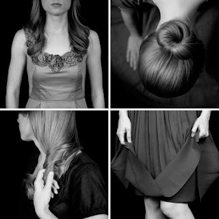
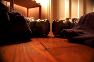
images for inspiration


These two images I found I liked because they aren't specifically of a person's
face, but more figurative in displaying the self. I definitely like the black and white images, I think I would like to do something like this for my own self portrait, but possibly with accents of colors in certain areas. I like the reflection used within the firts image of the sneakers, I like the idea of 'self reflection" and I think this resembles it well. I also like the second grouping of images, showing different parts of a person in different ways, showing emotion or just parts of the whole. I think both are great inspiration for using reflections, and parts of an image for a figurative self portrait that is black and white.
Friday, March 12, 2010
Photoshop ReVieW
By watching the videos on adobe photoshop I learned a lot, I had some use in the past with photoshop but watching the video gave me a better understanding on how to make selections to do what I want best with images. I learned how to edit the mid tones in the fill light command part of the correctin lighting video. This was helpful because that way when editing jpeg files I don't need to adjust the entire exposure, just the part I want. The first two videos with that presenter were a bit confusing to me, because they were fast and when keys for tools are used for macs/pc's such as "options" they are mentioned quicly I always forget about them. However I found the presenter who discussed adjusting a photo to black and white very helpful, especially because I think this is something that I will work with often on images, and have done so in the past. This is great for using references for a graphite drawing to create great contrast, so I found this video helpful. I also liked the presenter who talked about the camera raw option, I did not know about this tool in the past and by explaining it slow enough and basic for me I was able to understand how to use it, and it's purpose. Overall these videos I feel were helpful for me to start using the basics to adjust images and create more. I think I will need to reference back to some for assistance, especially the layers option because I found it important, but had trouble keeping up with the purpose of the "transparent" back ground was, etc.
Friday, March 5, 2010
in design review
I learned a lot of resourceful information watching the videos on in design, since I have never worked with in design I was surprised to see how similar it was to illustrator. I learned how to apply bulleting to just certain paragraphs, and how to make more general selections using the different tools, such as making entire word caps, that was previously lower case, as well as choosing a certain font for an entire paragraph. Since I learn best visual I was able to grasp most of the videos, although some I had to watch twice, such as the working with text option, I think it was the presenter I couldn't follow well it just seemed to go very fast, more than I could understand or grasp. I liked the first woman presenter, she explained everything to the fullest, and went slow enough that I could keep following each action she took on accomplishing the tasks using the tools. The working with text files video seemed most helpful to me, as well as the basic one selecting tool because without this, I wouldn't know how to perform the other tools correctly. I think that I will definitely have to go back& revisit the videos once again if I begin to make something in in-design, I really thought it was interesting how by using certain tools an action can be performed faster than manually editing it.
Subscribe to:
Comments (Atom)